Wednesday, February 27, 2008

Roni Horn - Photographer


The clip of Roni Horn was different from the other clips we've seen, because she had a very different story of her photography.  She has a true connection  with the focus of her pictures whether it be water, a friend, or her niece.  Roni sees something in water that many other people don't see and it is enough to make her life's work about it.   I liked how she talked about the dark water being a psychological darkness because it was a good metaphor about her piece.  The part that showed her images all throughout a university was particularly interesting.  Not only does she put effort into her photography, but the layout was important as well.  Bringing nature into the university seemed to be beneficial as a few of the students stated.  I also liked how she said that each person would have a different emotion or reaction to the set-up of the pictures because they experience them differently.  A person may not walk a certain hall until a new semester or a new year and it would take them a while to learn that path and see the other photographs.  There was a 'flow of people' and a 'flow of water' as they explained which was true from what I could see in the clip.  The other images I found interesting was the swimming pool locker rooms.  Roni took a place that many would not think is a good place to make a work of art and turned it into an emotional piece.  The peep holes produce the feeling of voyeurism and the wall to wall tile surroundings brought on the idea of a chess player.  Her deep connection to her work is clearly illustrated in her work.  

Wednesday, February 20, 2008

Stefan Sagmeister - Typographer


Stefan's bold way of expressing how excitement is needed in brochures, articles, etc... caught my attention.  The image of the man's body with the typography that looks like someone drew into the skin was fascinating!  I hadn't thought of typography as artistic talent because I hadn't really thought about the expressiveness that can come from it.  Emotion was definitely brought out for me when I saw his work and I valued his artistic methods.  It was interesting to see that he did most by hand, because he was the last generation to be taught that way before technology.  

David Carson Continued Thoughts


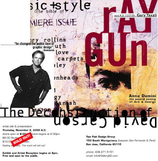
I liked how he spoke about mess-ups working towards your advantage sometimes.  Experimenting and playing with it might lead you to do something out-of-the-box, but it lets you create something different.  I learned some ideas about taking anything you can from one image, such as the corner, and blowing it up to create more images or layering them onto the original until you make a more creative image.  The way he took the headline of about noise and used that concept to make the typography "noisy" was a good idea.  David has a good way of utilizing what he has, whether it be the postage stamp of the envelope or the writing style of someone else, and making art from it.  Another part of this clip I enjoyed was the altitude and attitude article.  He used repetition to establish the 'attitude' and the article in the shape of a steep snowboarding hill to illustrate 'altitude.'  David's creative methods of utilizing emotion from typography is inspiring.

David Carson - Typography


I thought his type of art is really interesting.  His explanation on  how you can bring a group of people of the street and have them listen to a piece of music, and 9/10 would have the 'expected interpretation' and 1 would have an interpretation that meant something to them.  I agree that a meaningful interpretation can only come when it has personally inspired you, rather then going with what you think the right answer is, even if it is outside-the-box.  I also enjoyed how he took a boring article and used his skills with typography to make a spread.  The underlining story was still there, but a more interesting focus was brought on with the lettering he used.  I could tell from the clip that he was not the type to go by guidelines, but was creative on his own and does his artwork with his own unique style.  The typography art that we saw was interesting and a new type of art that I hadn't really thought about until we saw this clip =)

Wednesday, February 13, 2008

My First Completed Project! Accordian Fold Card


Using Photoshop to make my pictures enhanced was a lot of fun.  I was able to adjust the balance, contrast, and colors to make my pictures look even better then when I initially took them. Here is my first completed project of an accordian fold card.  I just took snapshots from the order form to get them in here (which I learned from the tutorials off Lynda.com) 


Wednesday, February 6, 2008

Photoshoppin and Camera Raw


I started off just taking some pictures on my break at work and ended up really liking a few of them.  I was able to use camera raw to brighten up the colors and make the focus of the picture more exciting, while keeping the background out of focus!  I used photoshop to add text and make the picture even more unique =)